Interior design withdrawal: How to pick the perfect chandelier
 Tuesday, May 9, 2017 at 06:34PM
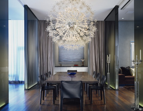 Photo by Wheeler Kearns Architects - More contemporary dining room photos
It's time to buy a new chandelier, and the choices are overwhelming.
So many shapes and styles and light sources. It helps to narrow things down. Are you attracted to ornate lighting dripping with rows of sparkling crystals? Or do your tastes run more toward angular forms – lights anchored within square lantern shapes or arranged upon linear frames? Advances in LED lighting have brought us so many options that resemble abstract art.
What follows is visual exploration of why certain styles work in their room.
When shopping for a chandelier, you usually settle on a group of choices, and then the narrowing down begins. A site like Houzz can be very helpful here. Not just for ideas, but because you'll learn by looking at lots of rooms that almost anything goes.
Search for images of “chandeliers in rooms,” and when you look at pictures, ask yourself if the chandelier is a focal point, or more of a functional piece that plays well with other elements in the room. Not every chandelier is made to be the room's star, as above. But when a chandelier is the focal point, the room's other features should be quieter, playing supporting roles while allowing the star to shine. In the room at the top of this post, for example, note the room's straight lines and the minimal use of decorative objects in relationship to the stunning "dandelion" chandelier.
A more functional chandelier should be compatible member of your design team, all working together for a gorgeous room. With the photos shown below, each chandelier manages to bring a bit of its own shine. I avoided picking rooms that seemed to have the lighting choices one would expect or where the overall design had the wow factor. In these rooms, each chandelier is a great fit that makes a significant contribution to the room's design.
If there's a light fixture that makes you smile and fills your heart with joy, there's likely a way to work it in – or to work in something like it. If you want to put a decadent crystal number in an otherwise spare farmhouse-style dining room, you will see a photo online that shows how someone else has made that work. For those among us who are less daring, working with an interior designer can streamline the process by facilitating the selection of pieces that will work well together. If you're not in a position to hire one, however, study images online for guiding characteristics that can be instructive when selecting fixtures and furnishings for your own home.
 Photo by Phillip Jennings Custom Homes - Search transitional dining room pictures
Line: Look at the lines of each chandelier to see how it compares with other shapes in the room. Is the table round, square or rectangular? Are the chairs backs straight shapes or curved. The Houzz photo shown at left is a great example of a chandelier whose form follows the lines of the room. Like the light fixture, the dining chairs have bordered edges. The entire room is driven by mostly rectilinear shapes: the table, the rug, the wall bricks and even the backs of the chairs in the ajacent room. Only the bar seating shows a slight curve for contrast. To my eye, this all contributes to a wonderfully relaxing design.
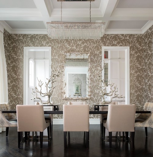
Practicality: If you like an assembly where strands of light are raining down from a ceiling panel, consider the ceiling height of the room where it would be used. In a home without soaring ceilings, you can select a model with shorter strands, as shown in this photo. This clever and quiet design has tree-like table sculptures with shapes that closely follow the botanical wall paper pattern. The strands of light in the chandelier above appear to be raining down to make them grow. Click each photo shown to get to the Houzz profile of the designer behind each project.
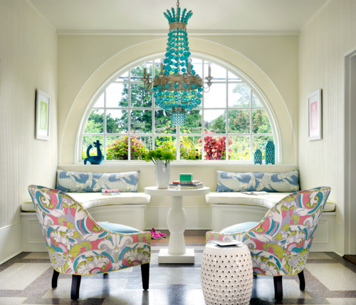
Color: Sometimes a chandelier is an investment piece that's just a fun addition to the room. Here, the lighting choice picks up colors from the room's fabrics.
Size: If one big chandelier in the style you like overwhelms your space, it's sometimes possible to hang a similar, smaller scale version in multiples, especially over a long dining table. In the case of a large table or a large room, using two chandeliers will more evenly distribute the lighting. Below, the chandeliers play to the wall color and metallic finish on the framed art.
 Photo by Elad Gonen - Search contemporary dining room design ideasThemes: Sometimes the lighting is a whimsical addition that helps to carry a room's thematic thread. In the lodge-inspired room below, the chandelier resembles antlers. It's among many similar styles available.
 Photo by Rocky Mountain Direct - More traditional living room ideas
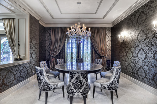
Twisting traditional: A traditional chandelier has a shape much like the patterns in this room's damask-dominant design. The framework of an elaborate tray ceiling enhances the light fixture.
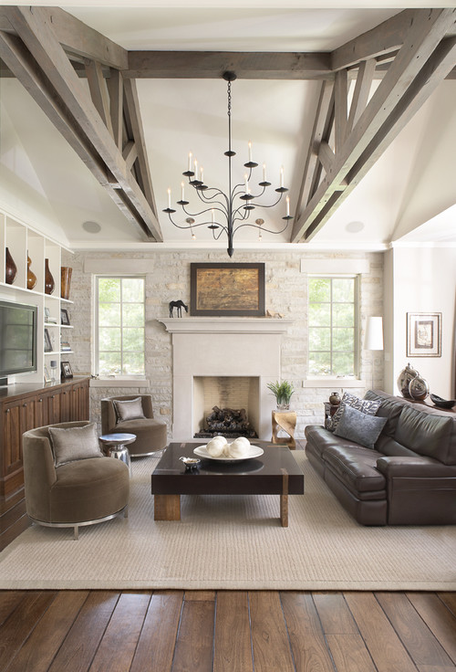
Material: Will a chandelier with a gold, bronze or silver base best support your room's color scheme? The black finish on this chandelier complements a room with many neutral tones and stands out as a striking addition. Hung high and flanked by the bulky beams of decorative ceiling supports, its delicate, curved form offers pleasing visual contrast.
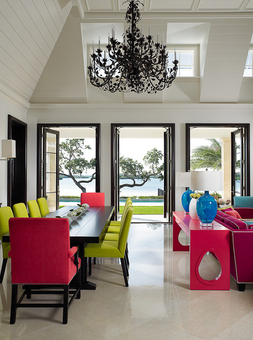
Setting-inspired: Sometimes the inspiration for a light fixture doesn't come from the room at all. In this playfully colorful Florida dining room, the light fixture seems to have been selected to bring in the outdoors. Even in its black finish, it calls to mind the shape of trees viewed through the room's glass doors.
Setting the scene: There are so many fun ways to make lighting choices. Here, a selection that extends and enhances the forest theme of the room's dominant artwork.
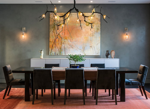 Photo by Kaufman Segal Design - Browse contemporary dining room ideas
A dream getaway: A woodsy, rustic cabin with the high style of thoughtful design.
 Kimberly L. Jackson | Comments Off |

Reader Comments (1)
Thank you for sharing detailed and helpful post. More info: interior design company